This began in the office, following a shaky morning online. I didn’t have Downdetector on all day, but you know how it feels when “something’s wrong” and everyone is half-asking if it’s them? In the evening, out of boredom and curiosity, I put together a small wallboard that gently tells me what’s wrong—without my having to prod it or squint at three tiny icons per row.
What it is?
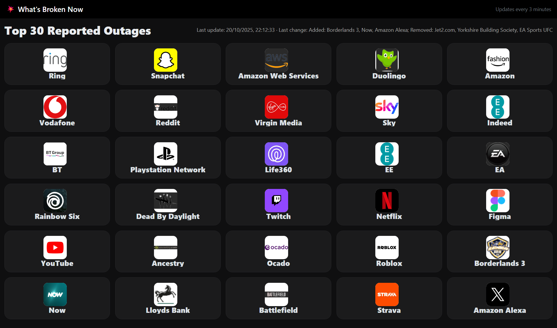
It’s a single, dark-mode page with five neatly spaced cards across (appropriate for a large screen). The logo is on the left, the name is on the right, and there is a simple header that shows when the list was last updated and changed. There are no graphs or faff – just a quick overview of “what’s broken currently.”
How I Actually Use It
It runs on a Windows PC connected to an office television. The PC runs through a slideshow of browser tabs, including this board. I don’t have to hover over it; it quietly refreshes itself every few minutes, and when it returns to the rotation, it’s up to current.
What it does behind the scenes (briefly)
There’s a little scraper that pulls a list of services that are now idle and saves it locally. The page reads the file and displays the cards. A secondary background task searches for appropriate icons – it first checks the service’s own status page, then a handful of common logo and favicon sources – so that most brands appear like themselves rather than generic blobs. Everything is cached, so even if a fetch fails, the page will load immediately.
Where it’s flawed (which is fine)
Icons can sometimes come out incorrectly. The web is disorganized: favicons migrate, CDNs sulk, and some sites do not promote a clean brand. If a logo fails to load, the card displays a little warning triangle to let you know the service is listed, even if the artwork hasn’t been completed yet. The background job keeps attempting, and the page cache-busts images, so fixes occur without my intervention. I can put up with the occasional discrepancy in return for a calmer screen.
Why I like this over refreshing Downdetector
I wanted something I could look at from across the room and instantly know if the world was on fire or if I could continue brewing tea. Downdetector is excellent for detail, however on a television, it feels tight and does not auto-refresh. This board is purposely opinionated, with larger writing, five-wide rows, and quiet background updates. It’s more about “ambient awareness” than dashboards.
Not a how-to!
I’m not going to share the code or turn this into a tutorial. It’s a small workplace convenience born out of a slow evening. If you’ve ever found yourself continually punching refresh after a difficult morning online, a quiet, self-updating board like this is really relaxing – especially when it isn’t stuck at three icons per row and no refresh.